Client
JJ LinHome of the music production company of Singaporean artist JJ Lin, working on JFJ was an unique experience for our team.
It was one of the few brands and websites that we had the freedom to experiment with new out of the box visuals.
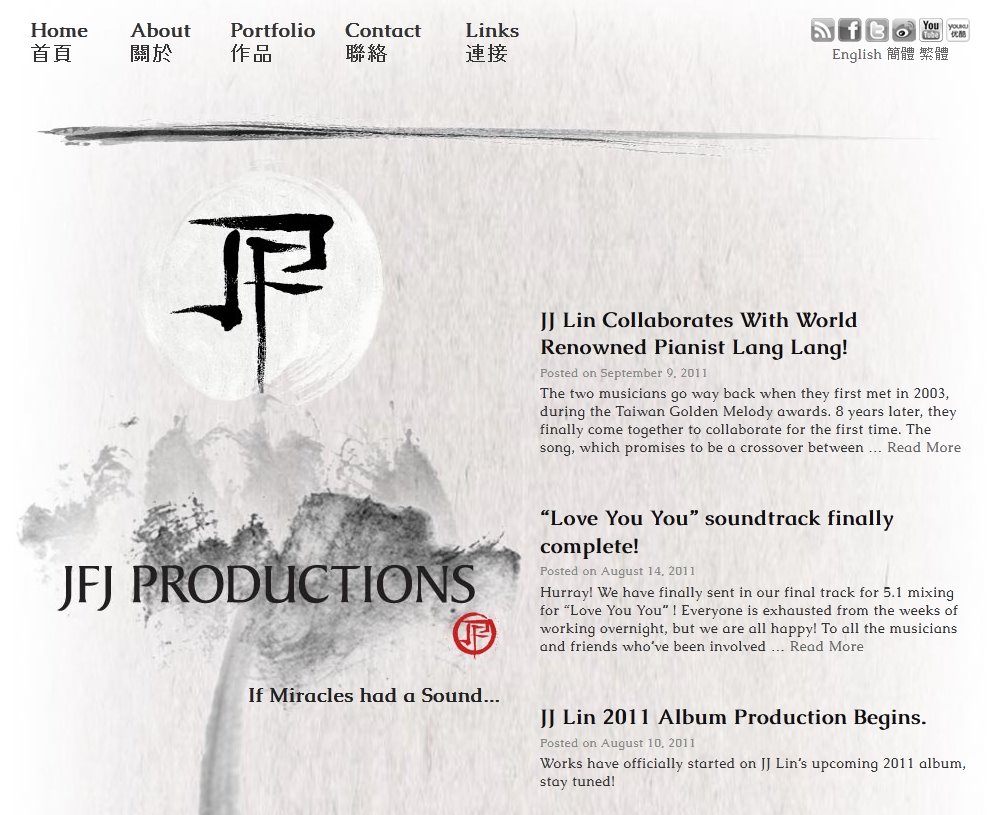
We decided on a look that took the brand towards a ink brush look on papyrus paper. Integrating simple elements using only black and white contrasted with the complex and random nature of paint brushes we created a white enso for the base for the black JFJ logo to sit upon.
Caudex was chosen as the primary font since it complimented the ink and brush style very well.
Finally a touch of red was added to bring the focus towards the centre of the page.

